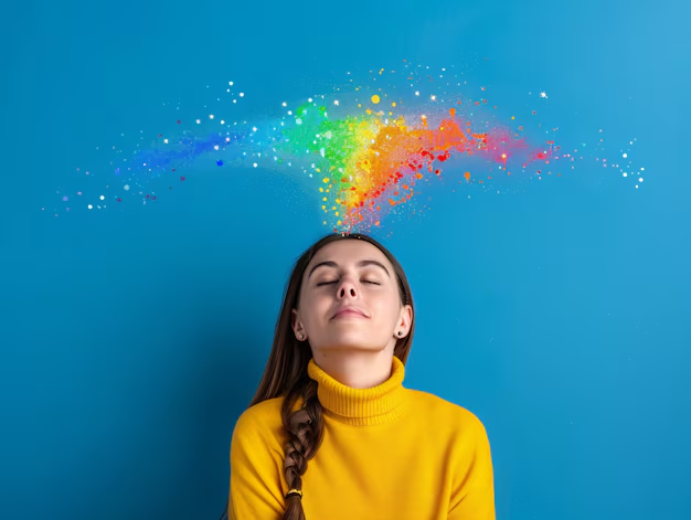
Lesser-Known Effects of Color Psychology
Most of us don’t consciously think about the impact of colours in our daily lives, yet everywhere we look, colours affect how we feel and the choices we make. Businesses, brands, and even interior designers understand the undeniable Color Psychology can have. But beyond creating aesthetic appeal, colour psychology has subtler, lesser-known effects that play an active role in decision-making and behaviour.
This blog will unlock how color psychology operates in unexpected ways, affecting not only our mood but also subconscious decisions ranging from what we buy to how we interact with others. You’ll also learn how these insights can be put into practice to create environments and opportunities that optimize positive outcomes.
What Is Color Psychology?
Colour psychology is the study of how different colours influence human emotions and behaviours. While most people understand the basics, such as red sparking excitement or blue inducing calmness, there’s much more to this fascinating field. Colours can evoke emotional responses, change perceptions, and even alter physiological reactions like heart rate or appetite.
Businesses often use colour psychology to communicate their brand’s identity or elicit specific feelings subtly. But the nuances of how and why this works go deeper, revealing intriguing connections between colours, culture, memory, and biology. Exploring Lesser-Known Psychology Areas can shed light on how subtle colour variations influence human decisions in unexpected ways
The Lesser-Known Ways Color Psychology Decisions
While much of the discussion around colour psychology speaks to generalities, like associating yellow with happiness, there are less obvious effects colours play in our day-to-day lives. Here are some surprising and research-backed influences:
1. Colors and Productivity Levels
Workspaces are increasingly becoming battlegrounds for productivity, and colours are being used as secret weapons. While bright shades like red are too stimulating for long periods, soft blues and gentle greens are known to enhance focus and creativity. However, lesser-known research suggests that introducing a balanced mix of colours leads to increased efficiency. For example, adding subtle pops of orange improves energy levels without overwhelming workers, striking an ideal middle ground between stimulation and comfort.
If you’re looking to redesign an office for optimal productivity, choose a palette that combines soothing and invigorating tones without tilting too far in one direction.
2. Appetite and Taste Perception
Restaurants’ clever use of colours in branding and interior design is no coincidence. Red and yellow are widely recognized as appetite-stimulating shades—hence their ubiquitous use in fast-food chains. However, “taste bias” is a lesser-known effect of colour psychology. Research shows that food or drink perceived through specific hues changes how we taste it.
For example:
- Blue foods are generally perceived as less appetizing because blue is rarely found in nature’s edible palette.
- Green packaging for chocolate gives it an eco-friendly or “healthier” image, even if the nutritional content remains the same.
Understanding these effects can help restaurants and businesses design better food experiences through cleverly chosen colours.
3. Emotional Anchoring and Memory
Colors’ effect on memory isn’t just anecdotal; science suggests that specific hues can anchor emotions associated with an experience. For instance, warm tones like golden yellows and terracotta reds can remind people of happy sunny days, creating associations with optimism and nostalgia.
When applied to settings such as retail or entertainment venues, brands can anchor positive memories and sensations to their environment. Beyond daily interactions, industries such as healthcare are also using these emotional anchors—such as soothing pastels in patient rooms—to enhance healing environments for patients.
4. Trust and Brand Perception
How much customers trust a company is influenced by colour, though this isn’t always overt. Cool tones like blue elicit calmness and reliability, often seen in industries like finance and tech, where trust is critical. On the other hand, businesses in pharmaceuticals lean toward whites and greens to evoke images of cleanliness and well-being.
The less obvious aspect here is the direct behavioural impact of these subconscious signals. If visitors to a website or a store feel at ease, they’re likely to spend more time engaging—and spending. Exploring lesser-known psychology areas sheds light on how businesses unconsciously widen customer loyalty through deliberate colour strategies.
5. Colour as a Social Cue
Colours also influence how people interpret and respond to social situations. For example, red doesn’t just symbolize passion; it also signifies dominance and power. Studies show that people wearing red are perceived as more authoritative, strong, and capable.
Meanwhile, neutral colours like grey and beige are seen as more approachable. Individuals can proactively use colours to shape impressions during key moments, such as job interviews or high-stakes meetings, by matching the mood they want to project.
Beyond Decision-Making – Color and Mental Health
Colours aren’t just tools for influencing day-to-day choices; they have profound implications for overall well-being. Designers of therapeutic spaces understand the value of specific shades in reducing anxiety or energizing individuals.
For instance, hospital pediatric wards often feature playful yellows to create a cheerful environment for young patients. Similarly, light violet tones sometimes grace meditation rooms to foster introspection and calmness.
Understanding these dynamics empowers individuals to use colours as tools for mood regulation and self-care in everyday life.

How to Harness Colour Psychology in Your Own Life
Whether you’re a business professional, parent, or simply someone curious about how psychology can enhance daily decisions, here’s how you can start applying these insights today:
Design Your Space Thoughtfully
Use environments you control—your home, workspace, or retail areas—to project the energy you want. For example, create a tranquil reading nook using blues and greens or stimulate creativity through bright oranges and yellows.
Match Colors to Your Goals
Planning a big presentation? Incorporate power colours like red to boost confidence. Setting up a dining area? Neutral tones balance warmth with relaxation.
Experiment with Taste Influences
The next time you create packaging or host a dining event, use colours to guide perceptions of flavour and quality for a more memorable experience.
Conclusion
Colour psychology runs deeper than we often give it credit for. Beyond its celebrated ability to evoke emotion, it’s a powerful tool for shaping habits, perceptions, and decisions in subtle ways. From how businesses build brand trust to how environments reduce anxiety, the applications of this science are as diverse as the hues on the spectrum.
Next time you pick out an outfit or redecorate a room, pause and think about the colours you’re using—they may be saying far more than you realize. Read more here and Thank you.